Redesigning Discreet Notes
Rebuilt from four specific usability failures, then tested against the original to prove it actually landed
Company
Independent
Role
Design & product
Scope
iOS app
Status
Shipped
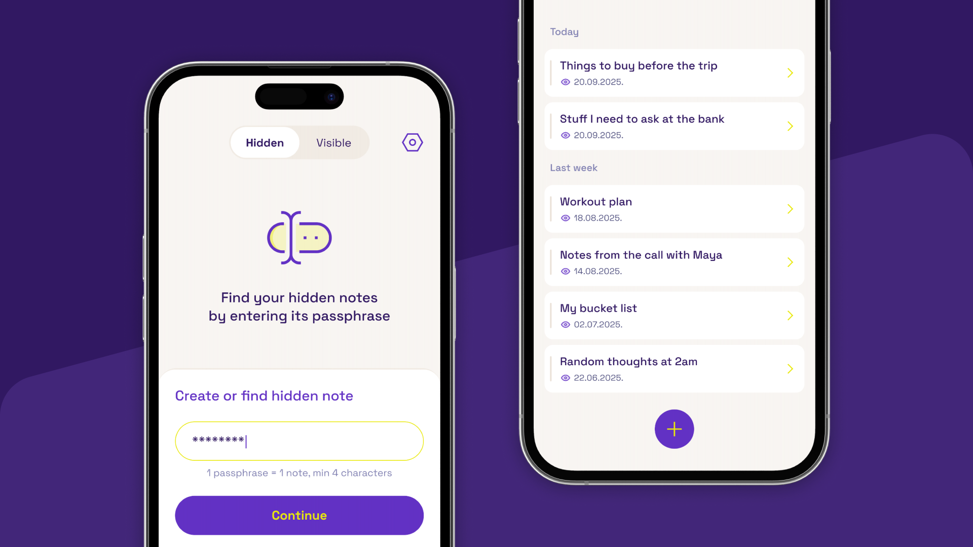
A notes app where privacy isn't a setting you toggle — it's an absence. Hidden notes carry no title, no preview, and no count. Enter the wrong passphrase and it isn't just locked. As far as the app is concerned, it never existed. Design and product work, built end to end with a friend and shipped on the App Store.
Starting from a rougher version
An earlier version of the app already had the core idea working, but testing surfaced real friction underneath it: people couldn't tell how to add a note, couldn't figure out how to find a note they'd hidden, couldn't find their way back to the visible list, and the whole thing read as dated. The redesign started from those four specific failures, not a guess at what might be wrong.
Teaching it in the moment, not in a manual
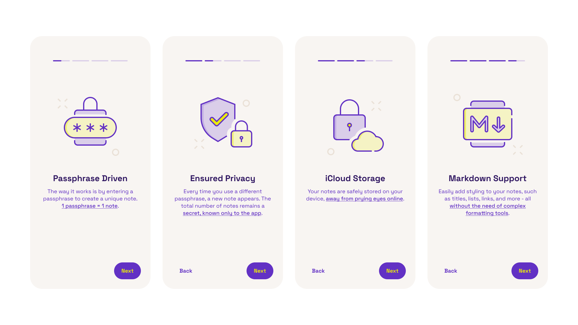
Discoverability was the bigger half of the problem — three of the four failures were about people not finding something that already existed, not the app doing the wrong thing. So we added a short onboarding flow, shown the first time someone opens the app, that points at exactly where to add a note, how to find one you've hidden, and where the visible list lives. It doesn't try to explain the whole app, just the handful of moments testing showed people actually got stuck on.
A note that doesn't exist until you ask
Most “private notes” features work like a locked drawer — you can see it's there, you just can't open it. Discreet Notes works differently. A hidden note has no title, no preview, and isn't counted anywhere in the app. The only way back in is the exact passphrase used to create it. Forget it, and there's nothing left to recover — no reset flow, no hint. The note isn't protected. It's gone from view entirely.
Visible notes still work the way you'd expect. Mark any note as visible and it appears in the list like a normal to-do or thought — switching between the two is a single toggle, not a mode you have to think about. Every screen had to avoid leaking metadata the same way the hidden note itself does — nothing that hints one exists anywhere it shouldn't. The absence had to be uniform, not just the content.
A different kind of lock
The logo started as a literal padlock — legible, but generic security iconography that could belong to any app promising to keep something safe. It moved toward something closer to a notebook or diary mark instead, something that reads as writing before it reads as security. The two colors carry the two halves of the product: purple for privacy, yellow for the personal, creative side of actually writing something down.

A voice that doesn't lecture you
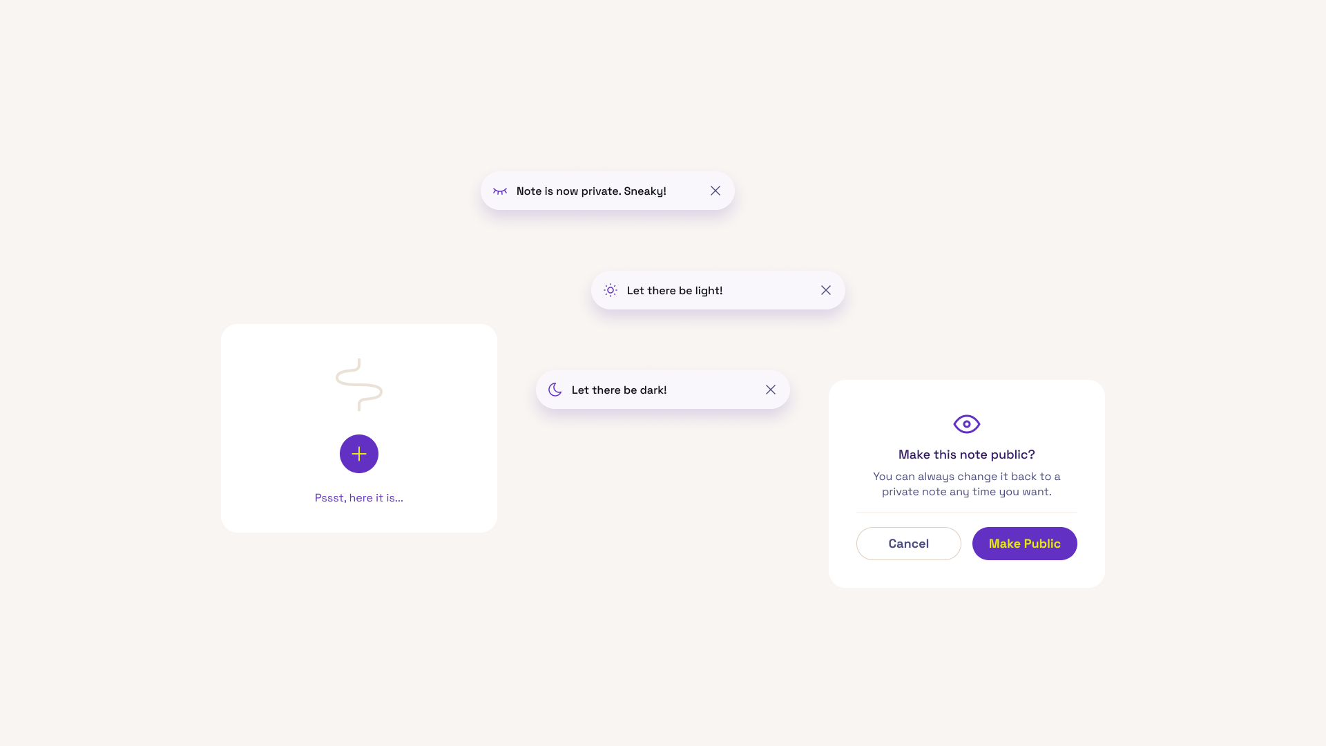
The copy throughout is playful and a little cheeky instead of technical or serious — “Note is now private. Sneaky!” when you hide something, “Let there be dark!” on the theme toggle, “Pssst, here it is…” waiting on an empty state. None of it explains what privacy means. It just makes the moment feel less like a warning and more like part of using the app.
Markdown first, formatting second
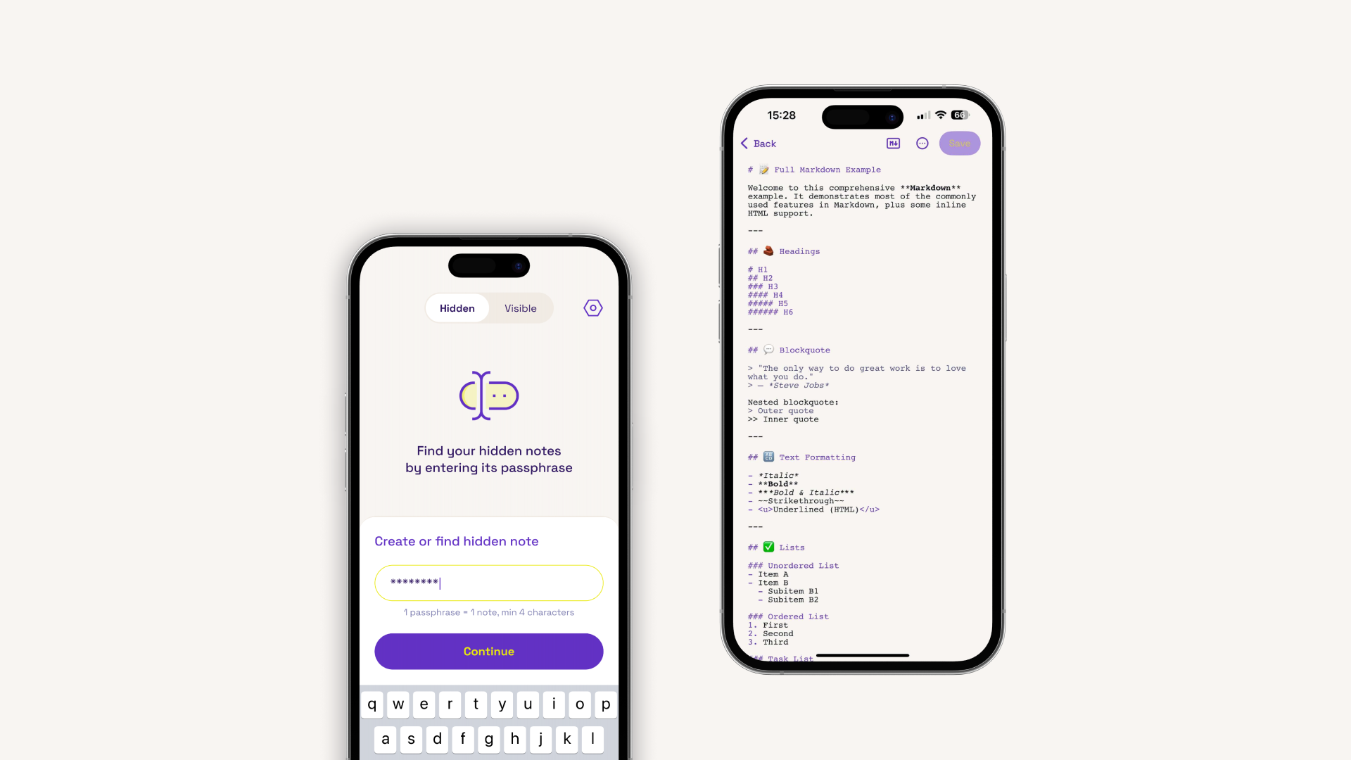
Notes are written in plain Markdown, then toggled to a rendered preview. Writing stays fast and unstyled while you're thinking, and the formatting shows up only when you want to read it back — useful well beyond journaling, for drafting posts or dropping in a code snippet without the editor fighting you over syntax.
Nothing to trust but the device
Notes sync through iCloud and nowhere else. The developer collects no data from the app — there's no third-party server in the loop to worry about, no account beyond the Apple ID already signed into the phone. Dark mode was treated as part of the same brief: the app is built for writing late, discreetly, without a bright screen giving away that you're using it. Shipped on the App Store under an independent developer account, rated 5.0 from early users — a small, complete thing, redesigned with a colleague from Tamna Strana for the developer friend who built it.
What changed
Nothing here was a single feature swap. The identity, the onboarding, the tone, the way hidden and visible notes are kept apart — all of it moved together. What used to feel like a set of loosely related screens now reads as one cohesive app, and the parts that used to confuse people (adding a note, finding a hidden one, finding the visible list) are the parts we designed around first, not an afterthought.
Testing whether it landed
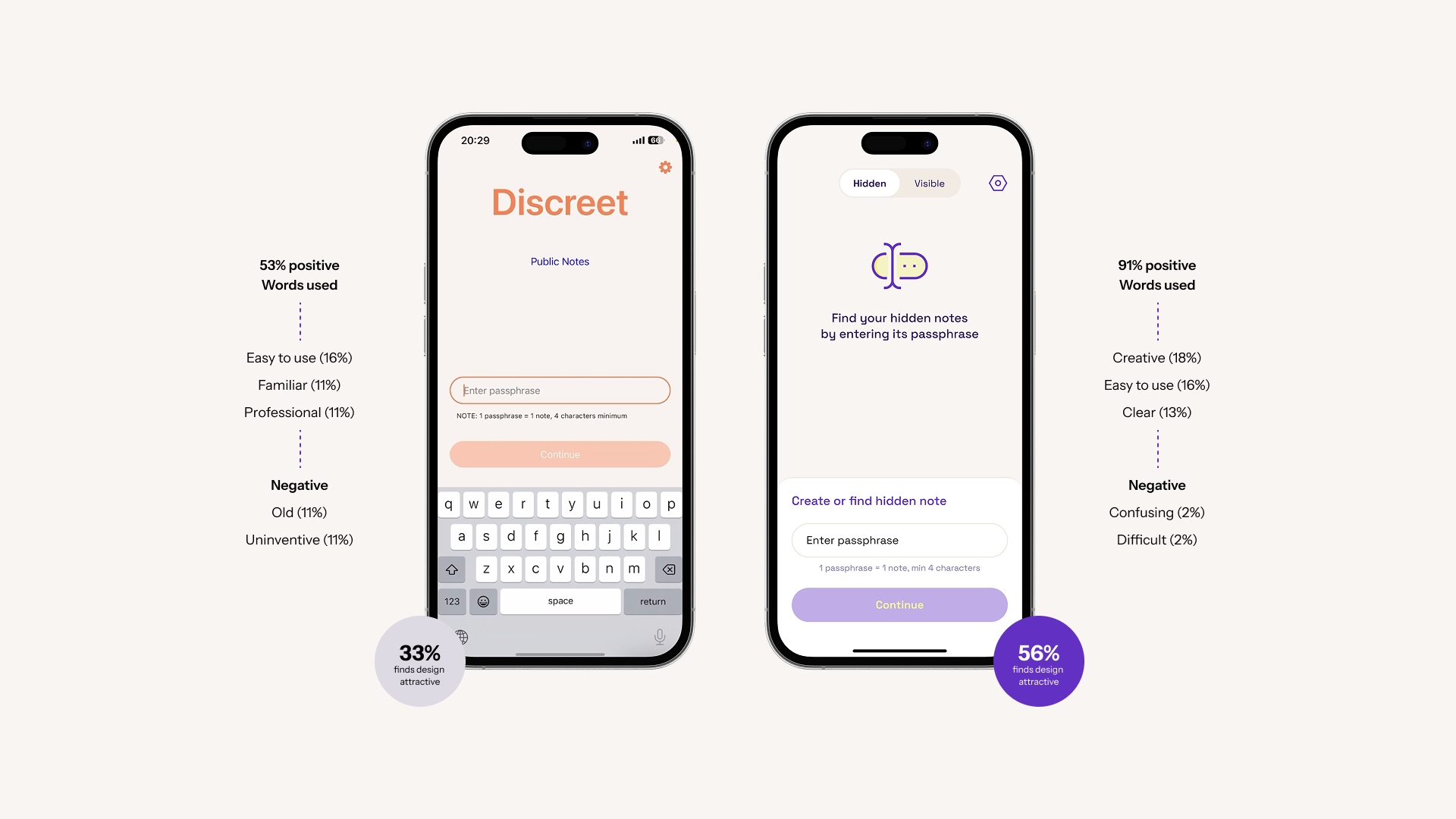
Rather than assume the redesign was actually better, we ran a desirability comparison between the old direction and the new one. 33% of participants found the original attractive; 56% found the redesign attractive. Nine people isn't a large sample, so we read this directionally rather than as proof — but the words people reached for shifted along with the number.
What this changed, in practice
Redesign scope
Identity, onboarding, tone, and information architecture all changed together, not as separate fixes — the app now reads as one cohesive product instead of a set of loosely related screens.
Desirability
56% of surveyed users found the redesign attractive, up from 33% for the original — a small sample (9 people), but a clear directional signal.
Perception
The original pulled words like 'old' and 'uninventive'. The redesign pulled 'creative', 'easy to use', and 'clear'.